Unified Growth Solution
World-class tech needs world-class drivers. AI platform and expert services, unified
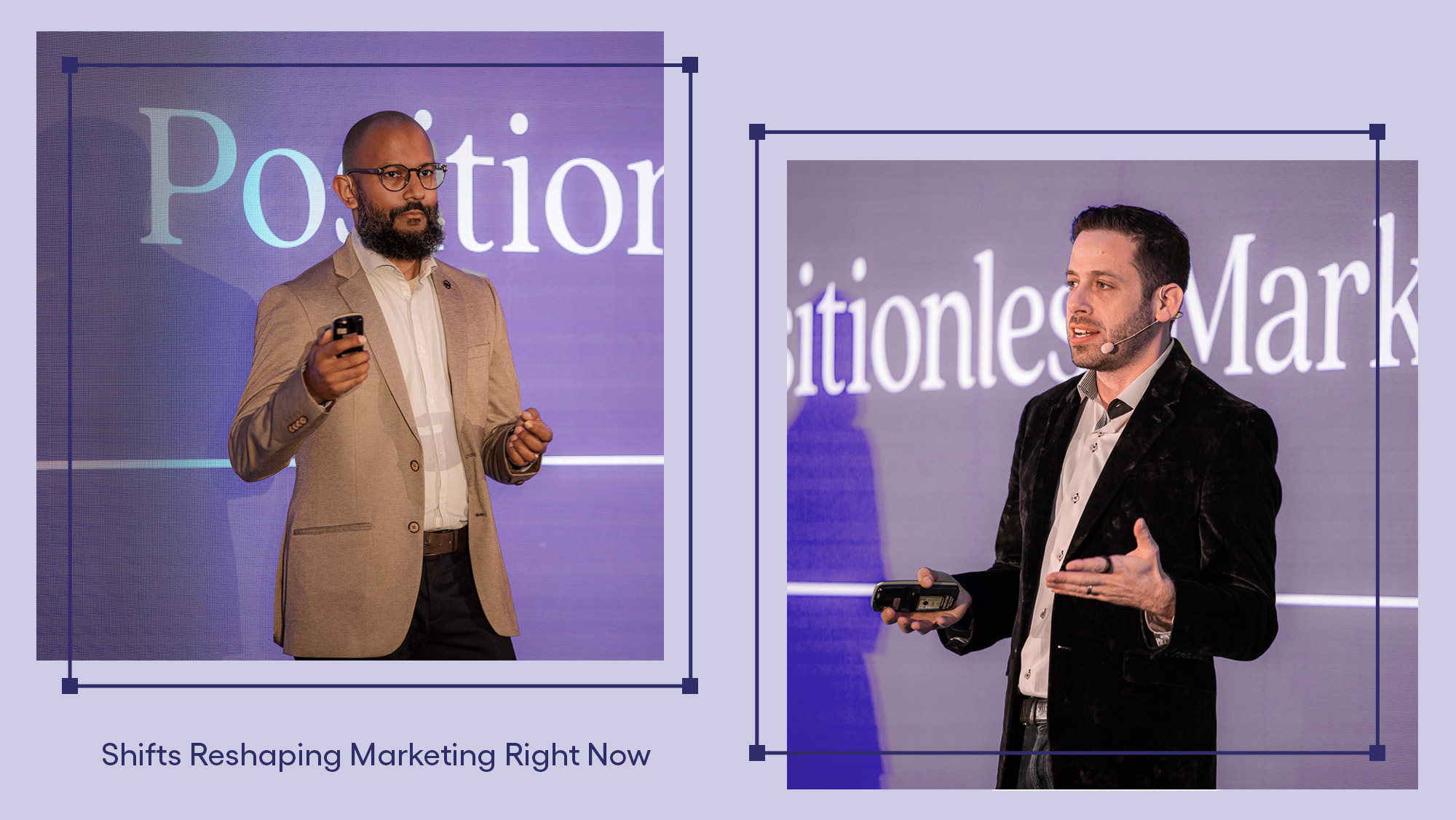
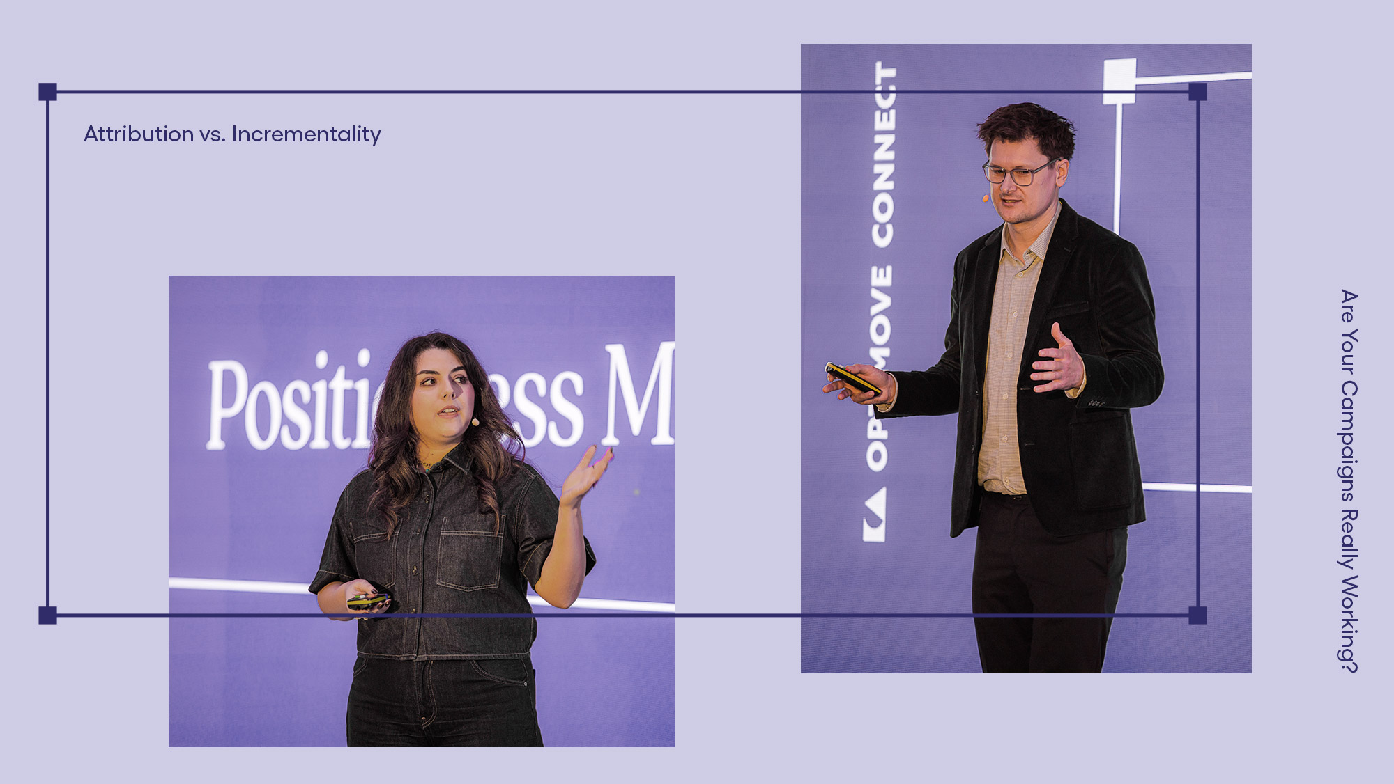
Order a free copy of the Positionless Marketing book
Blog
A collection of stories, insights, and news on our capabilities, proprietary research, evolving marketing trends, and the future of Positionless Marketing